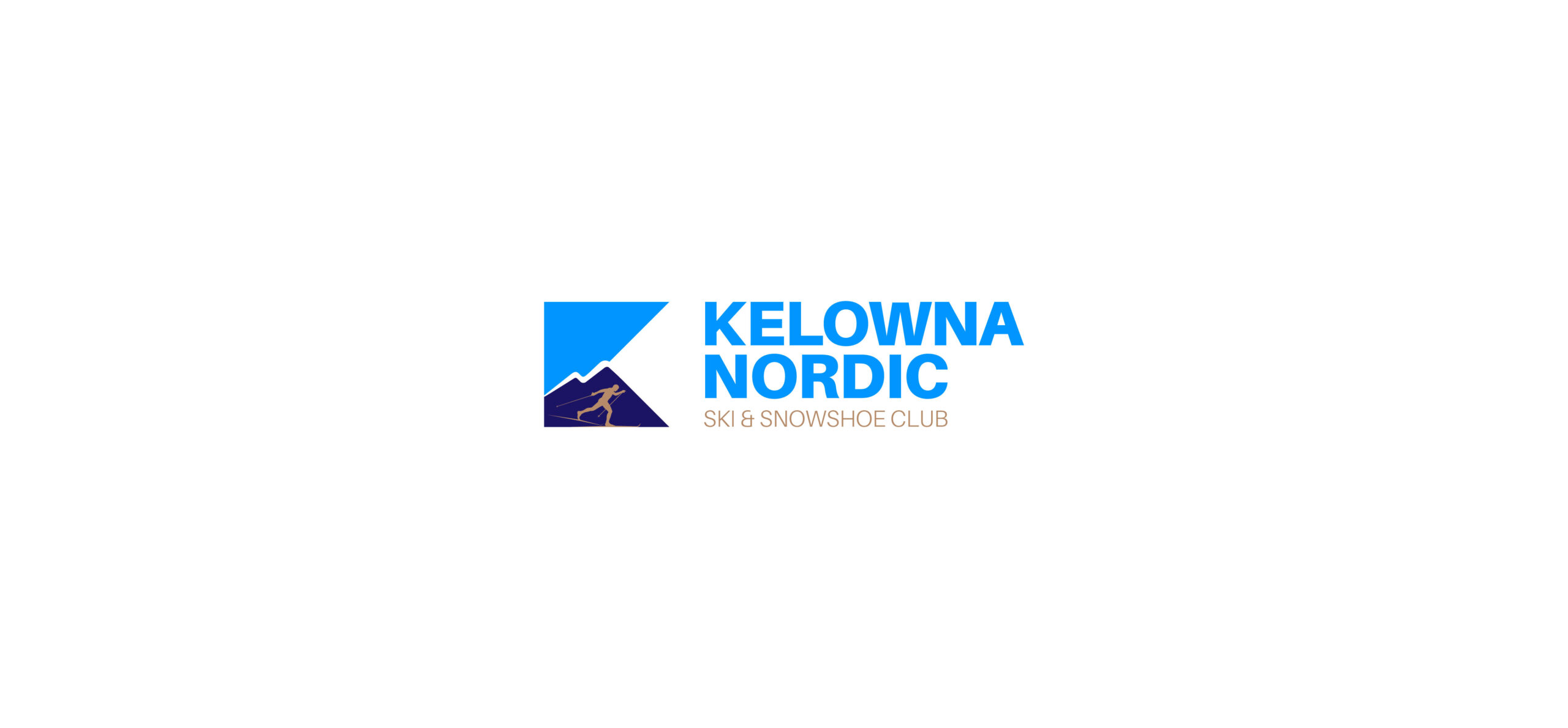
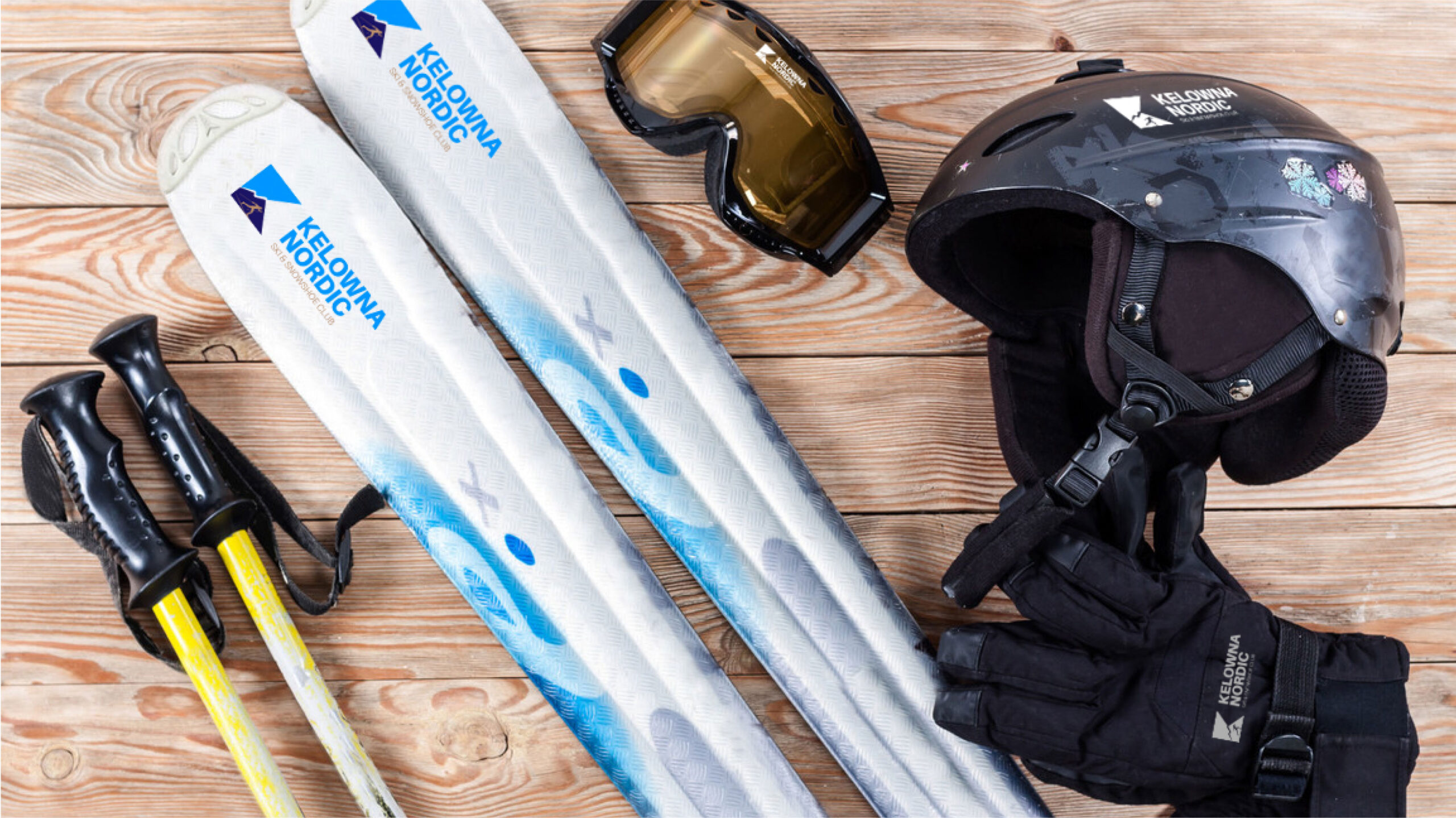
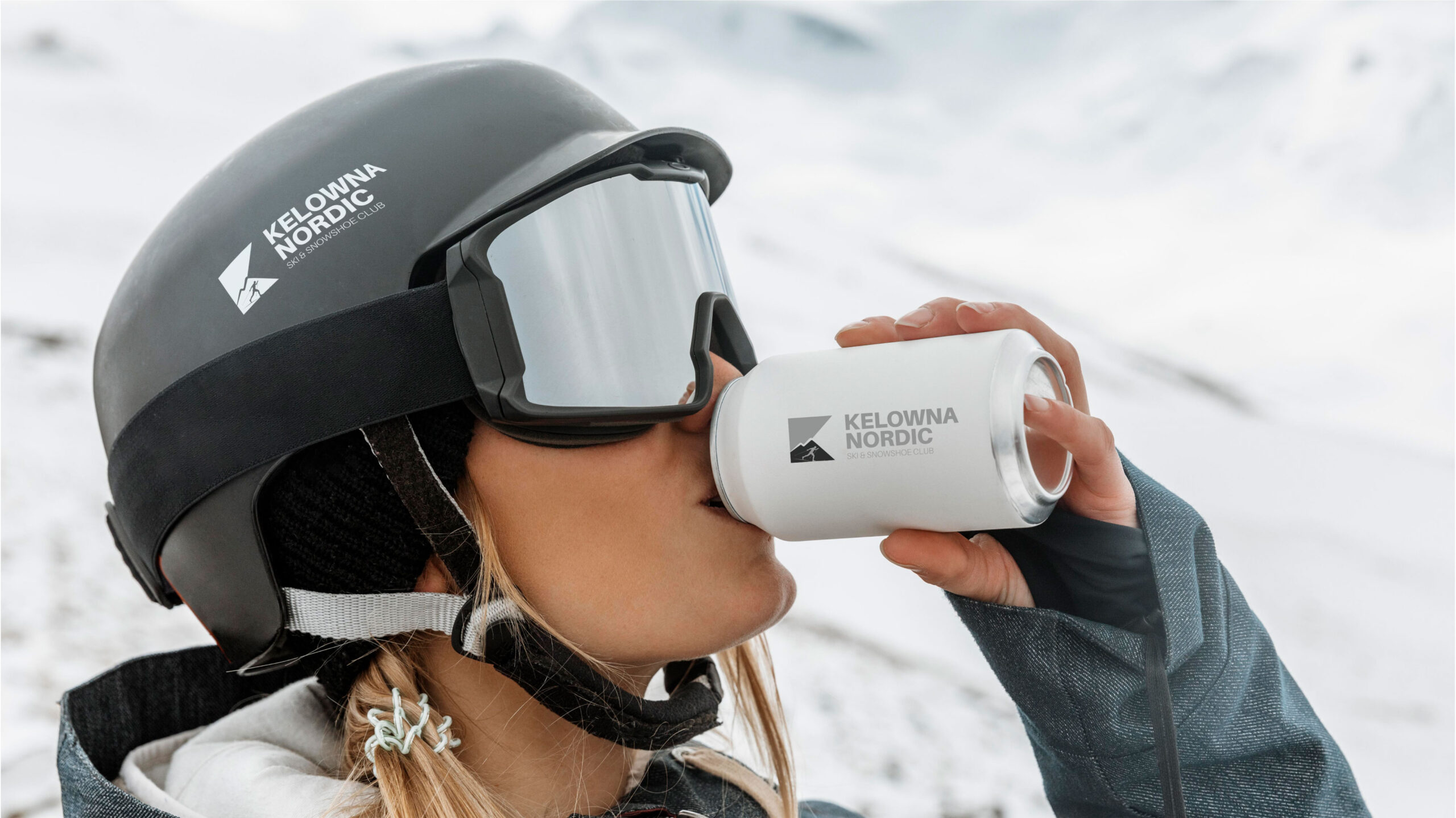
Kelowna Nordic
“Nordic is a well-known region in Canada, primarily inhabited by people of Norwegian descent who possess a profound passion for a particular style of skiing. This sport enjoys widespread popularity and a long-standing tradition among them.
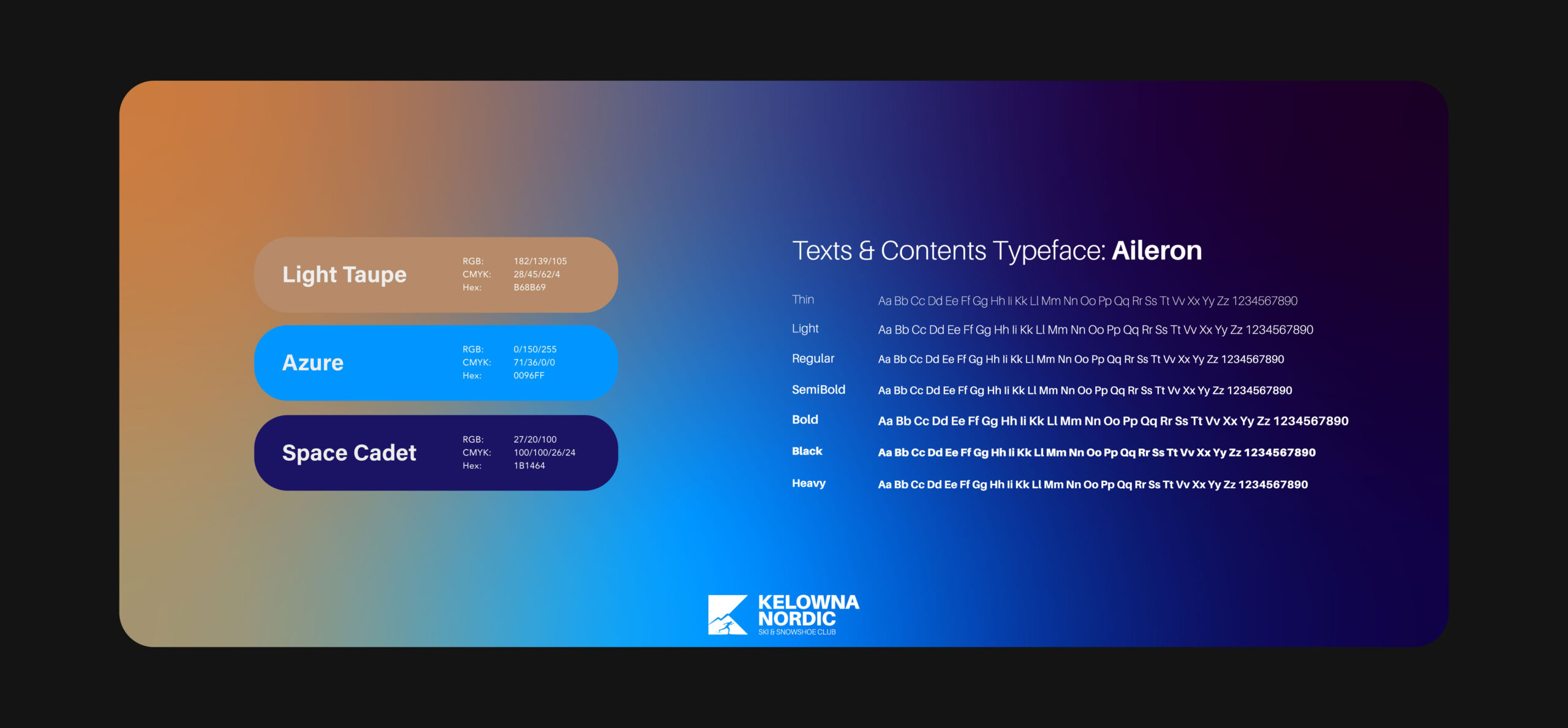
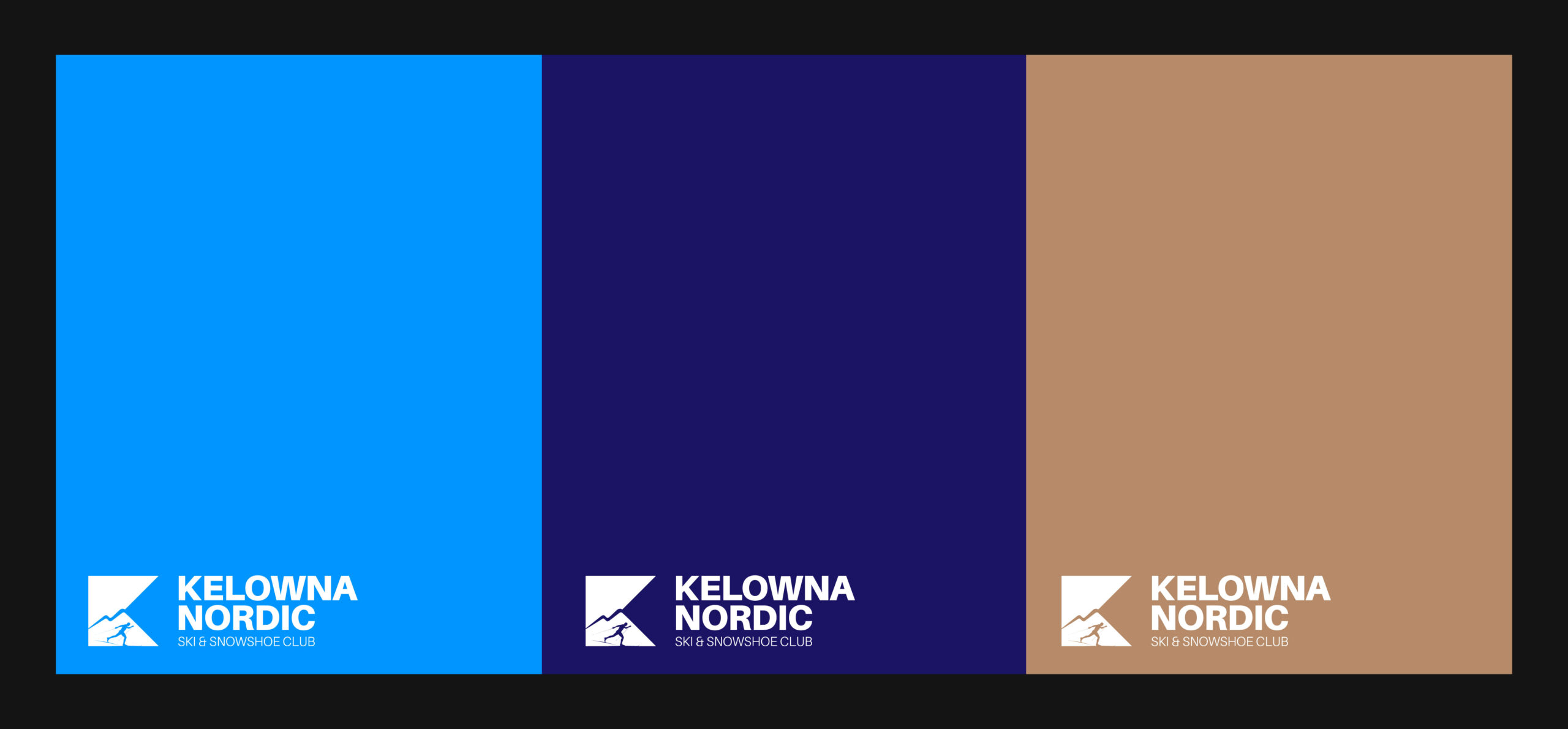
In designing a logo for this region, it is essential to convey the authenticity of the Nordic area and the sport cherished by its people, through a clear and articulate design. The judicious use of cool, wintery colors, complemented by a subtle touch of warmth, is crucial for expressing the warmth and profound affection for this sport. Furthermore, the incorporation of symbolic elements such as mountains, the sky, and a skier significantly contributes to the logo’s effectiveness.
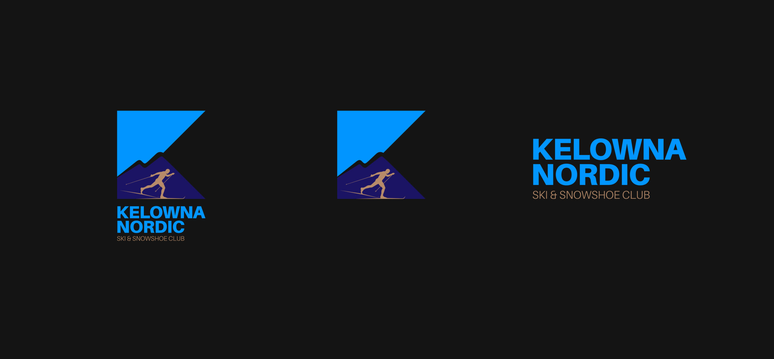
A subtle yet significant detail within the logo’s structure is the clever integration of the English letter ‘K’. This element is harmoniously embedded within a regular framework that encompasses the symbolic representation of the sky and mountains.”
Client: Unknown
Category: Brand Identity
Date: June 25, 2023
Team Members
Art Director & Graphic Designer: Hamed Shahbazkhan
Project Manager: ADICATOR DIGITAL MARKETING