Quinlan Inc.
Brand Identity
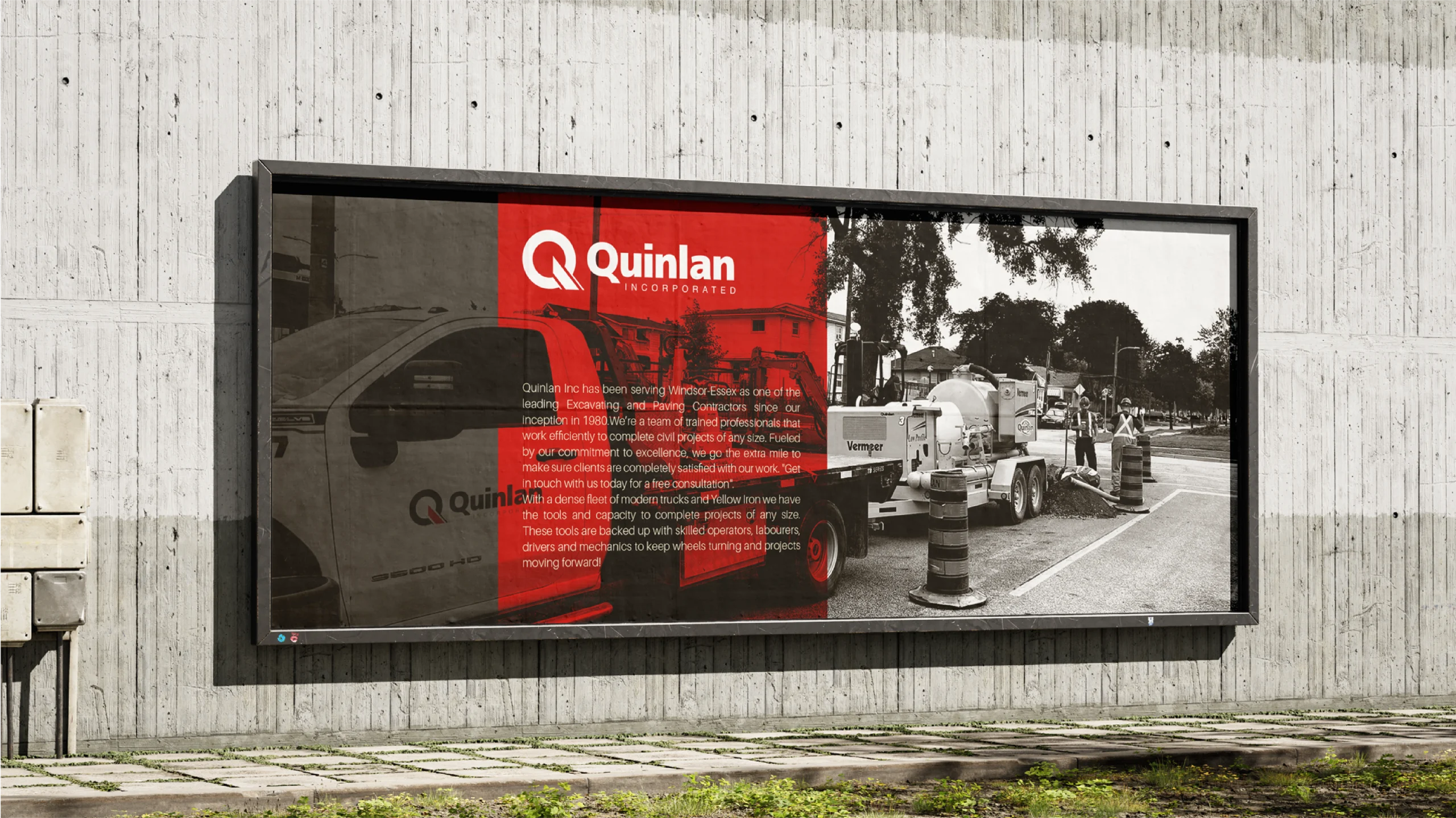
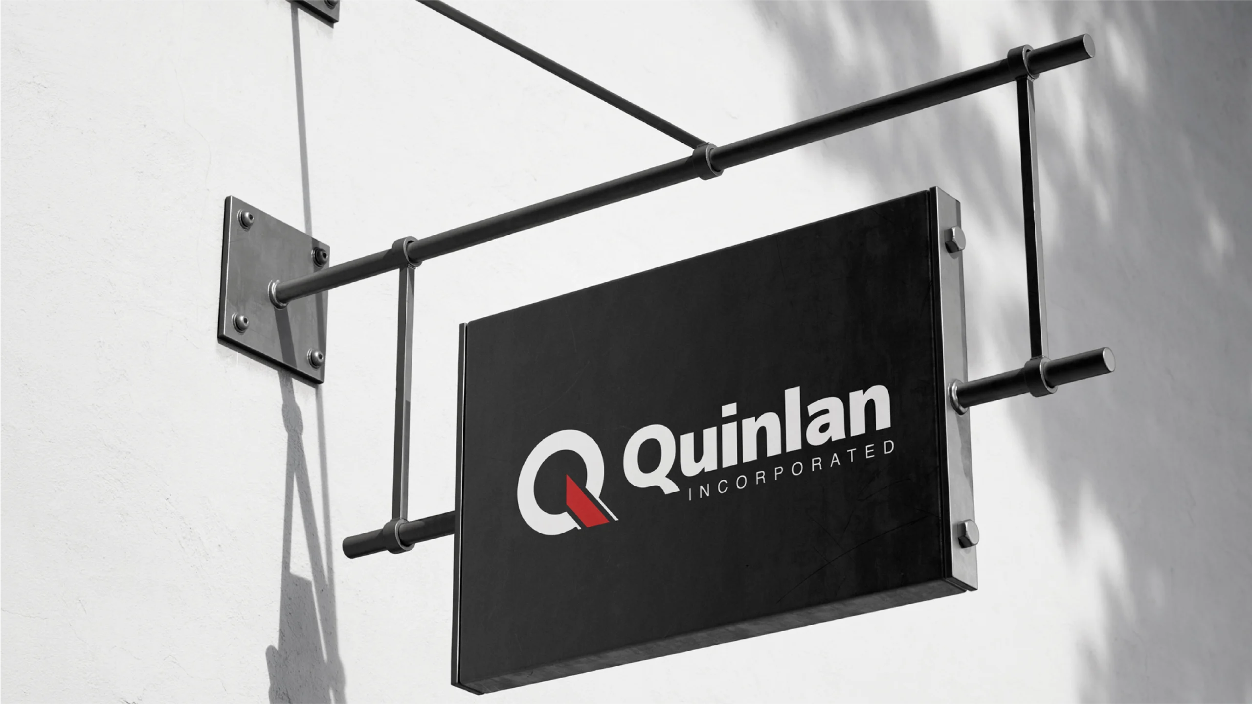
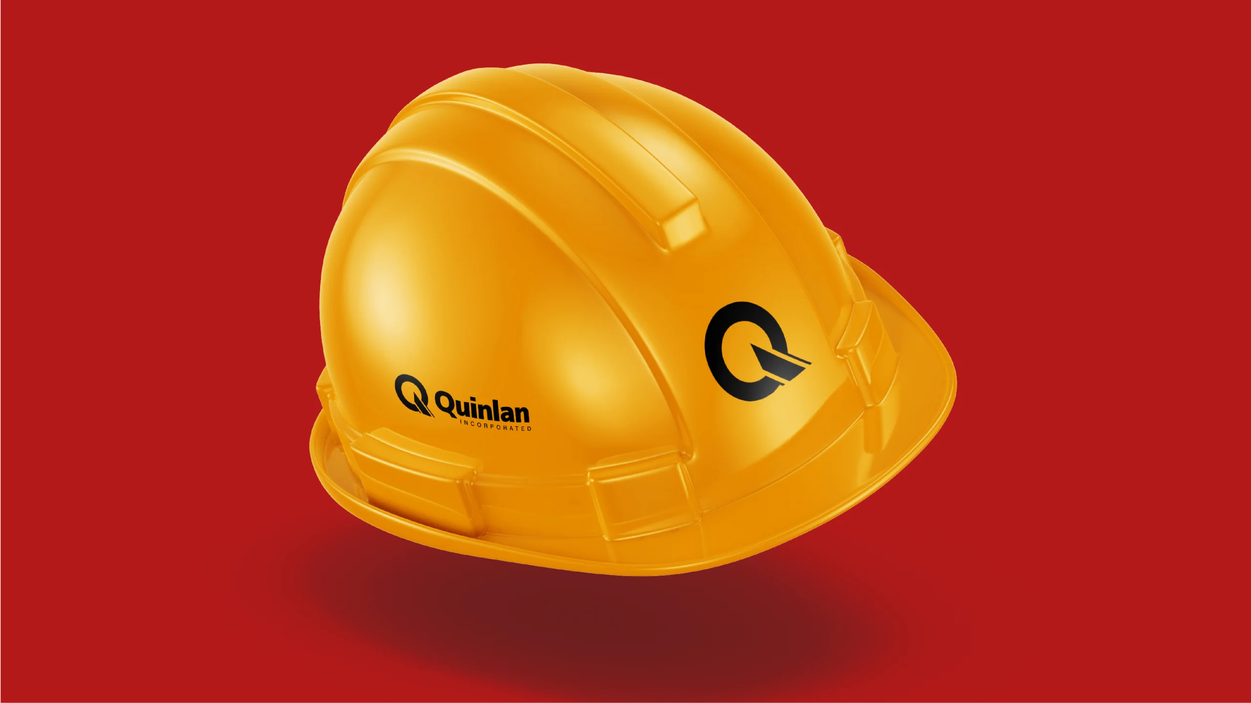
Quinlan Inc.
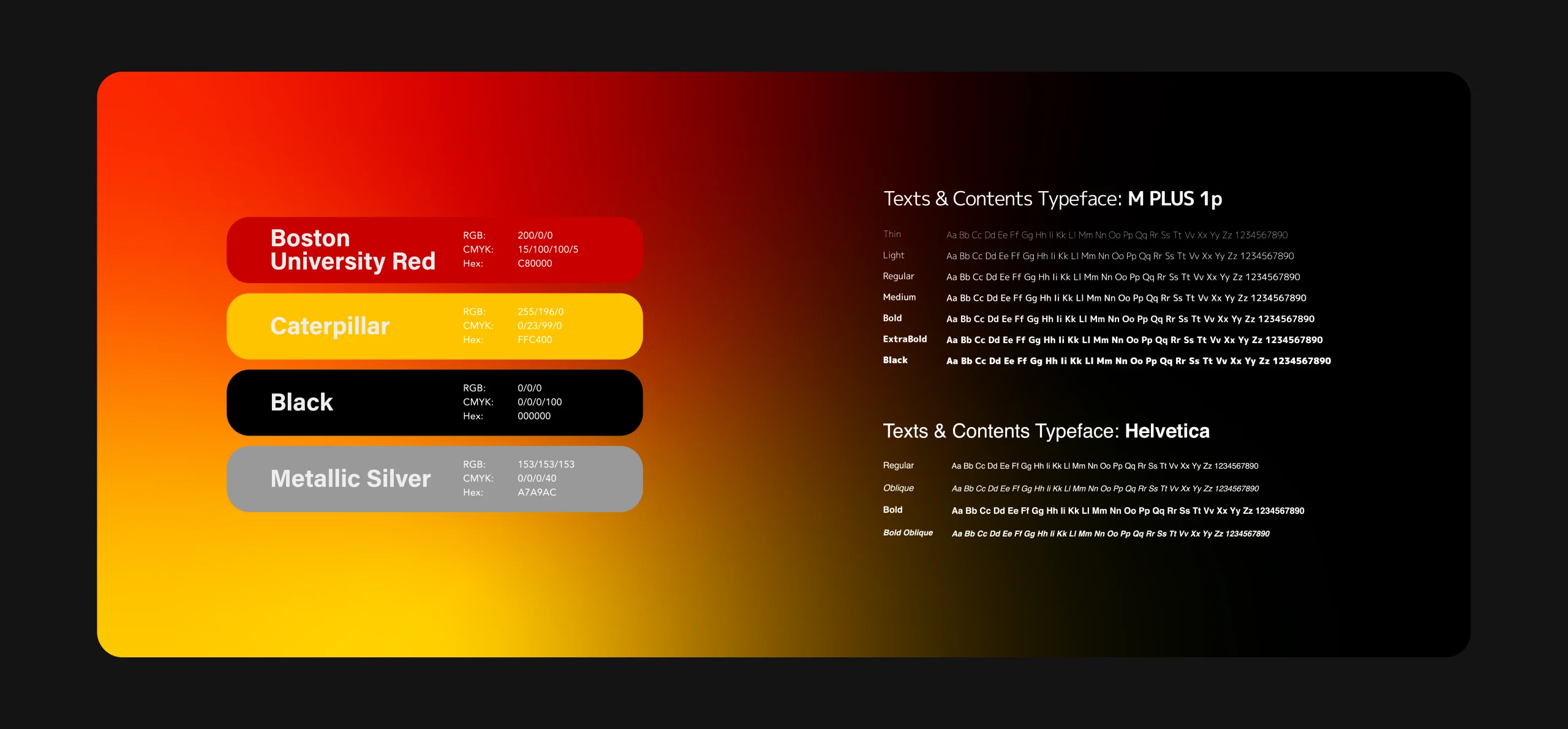
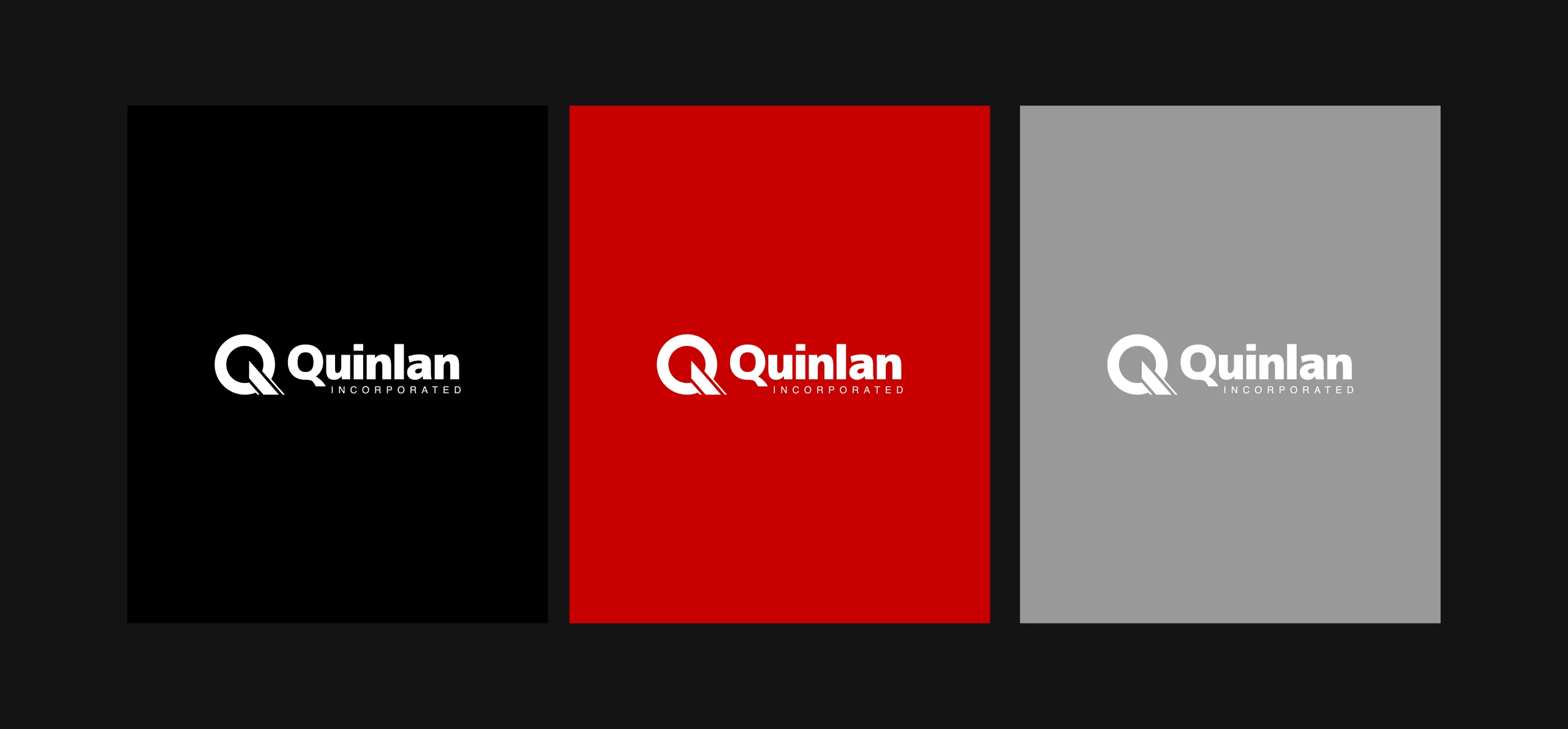
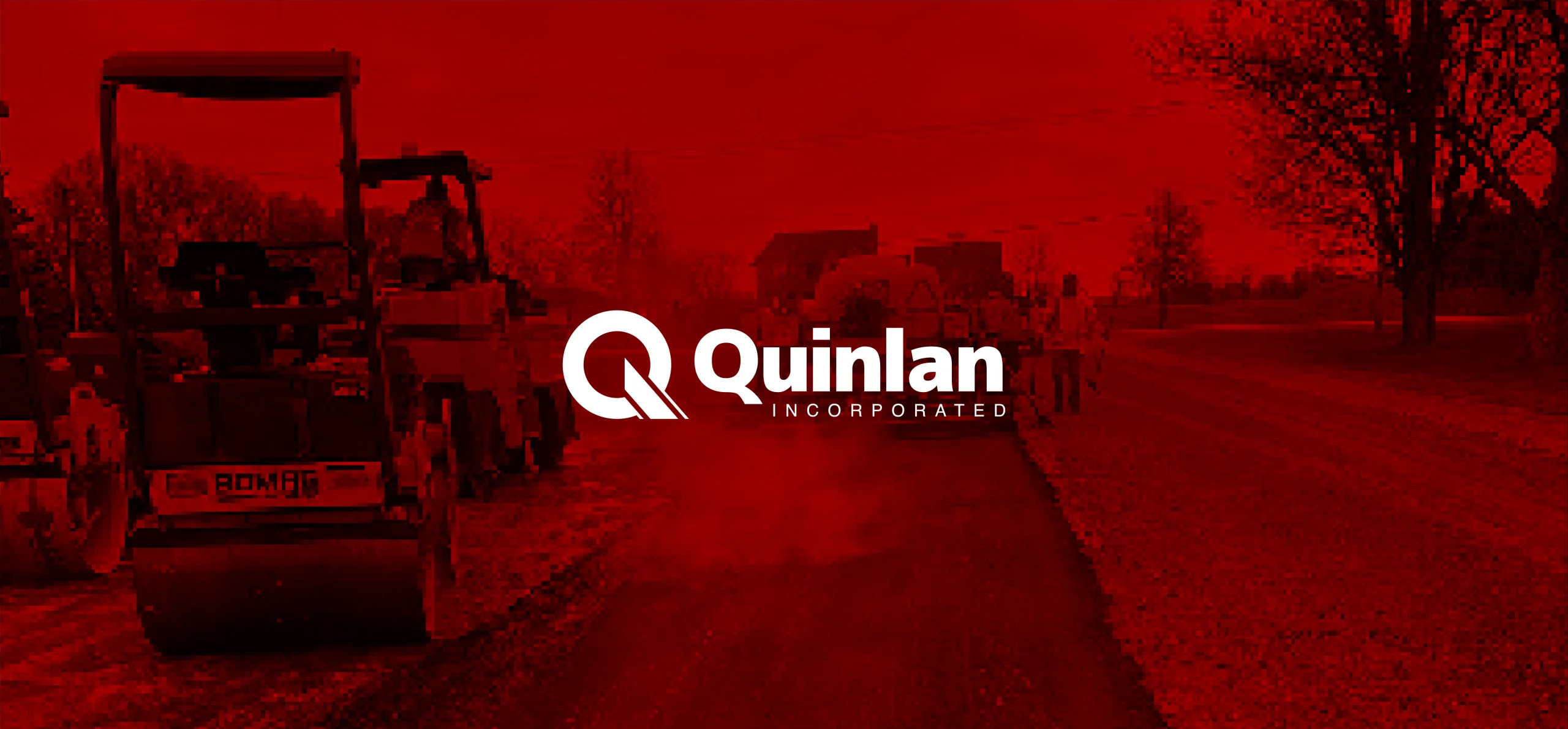
In the design of this logo, the focus is on expressing the message based on a monogram inspired by the concept of excavation and general contracting services, construction. The use of thick and strong lines in the logo, which indicate endurance and durability, and the use of a part of the logo with a colored line, expresses the meaning of the road, path and excavation.
Client: Grant Quinlan
Category: Brand Identity
Date: September 3, 2023
Team Members
Art Director & Graphic Designer: Hamed Shahbazkhan
Project Manager: ADICATOR Digital Marketing Agency